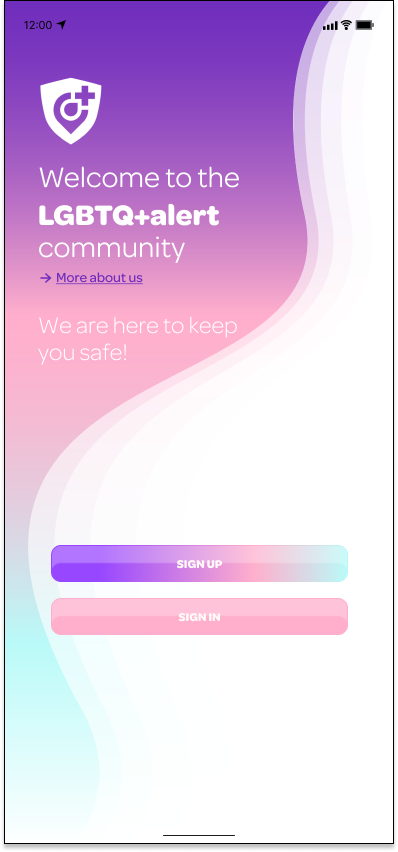
LGBTQ+ alert
Problem
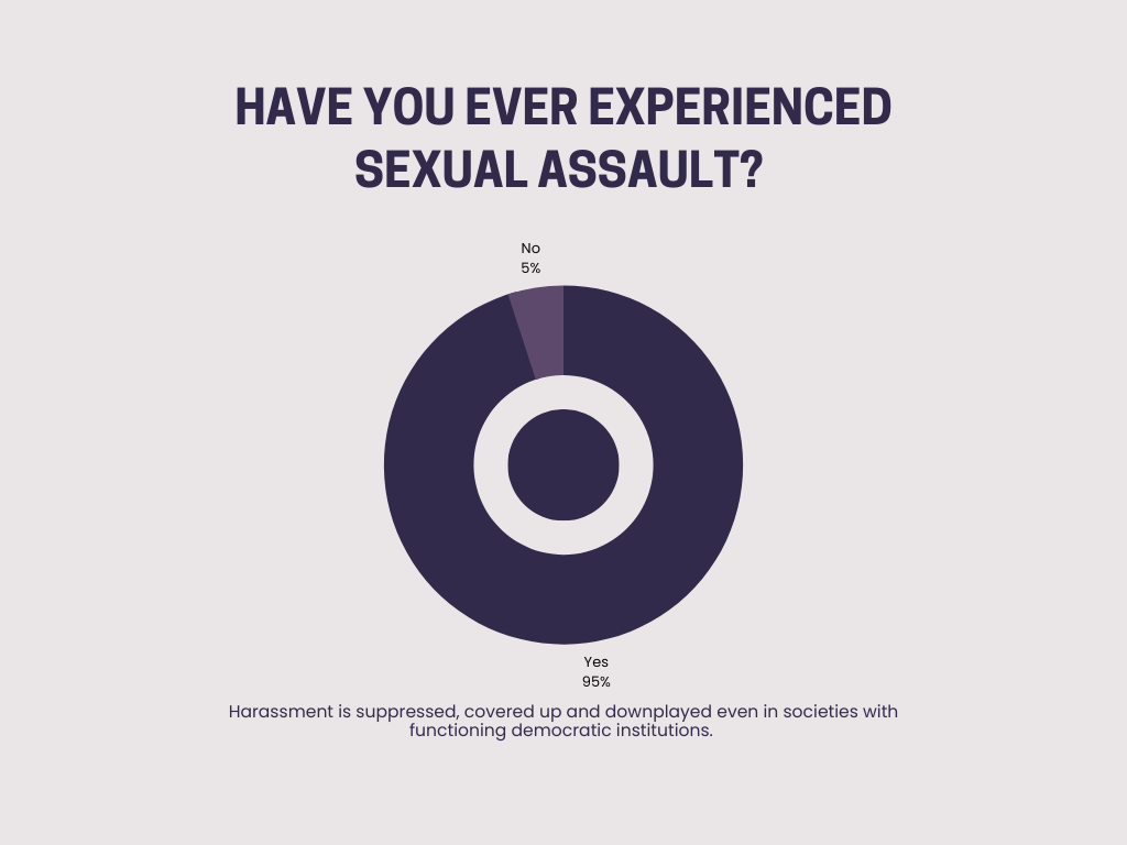
Harassment is suppressed, covered up, and downplayed even in societies with functioning democratic institutions.
Being part of the LGBTQ+ community often means dealing with prejudice and harassment from childhood on, bullying can range from verbal abuse, such as name-calling, to life-threatening physical assault. And Even if young people escape physical violence, the effects of bullying can be psychologically devastating.
For many people, the figures continue to reflect an alarming everyday reality: living with the fear of being harassed or attacked just for being who they are.
Potential Solution
I leveraged data throughout the entire process, to create an awareness campaign, and design an end to an end mobile App, which aims to give a voice to the victims, create a safer environment for the LGBTQ+ community and aid better communication between these communities.
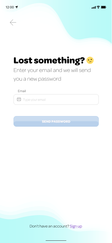
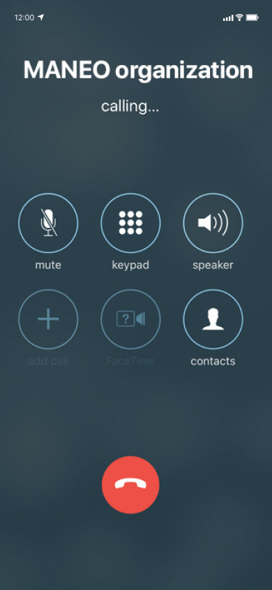
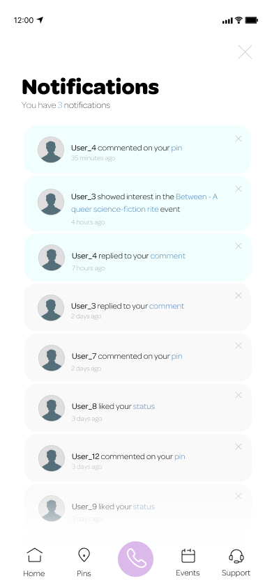
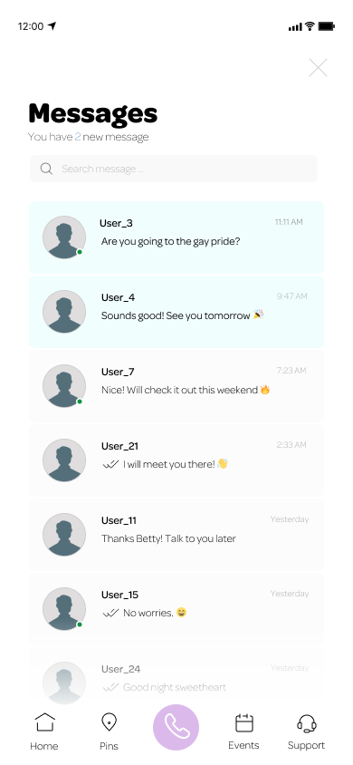
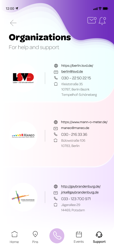
The app is also connected to a hotline, a confidential resource available via online chat and by phone, to speak with someone already trained to help the victims who have experienced some public misconduct, including sexual harassment and bullying.
UX Research
Research Goals
.Research enables me to dig deep into my understanding of users - not only their immediate frustrations, but also their hopes, fears, abilities, limitations, reasoning, and goals. And more importantly, locate the issue. It lays essential foundations for creating solutions in later stages.
.To ensure the research stays on track and better guide the responsive website design later, it is important to create a research plan before diving into the research phase. I listed research goals, research questions, assumptions, methodologies, participants, and timeline in my research plan.
Primary Research
Survey: Harassment towards the LGBTQ+ Community
Secondary Research
Organization Interviews
User Interviews
Key Insights
The findings show that people get harassed at least once a month.
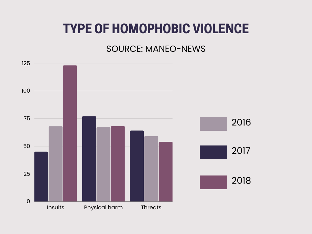
Sexual Harassment can be shown in many different ways: Unwanted physical contact, suggestive remarks, staring or leering, invasion of personal space, unwanted comments on dress or appearance, and jokes of a sexual nature.
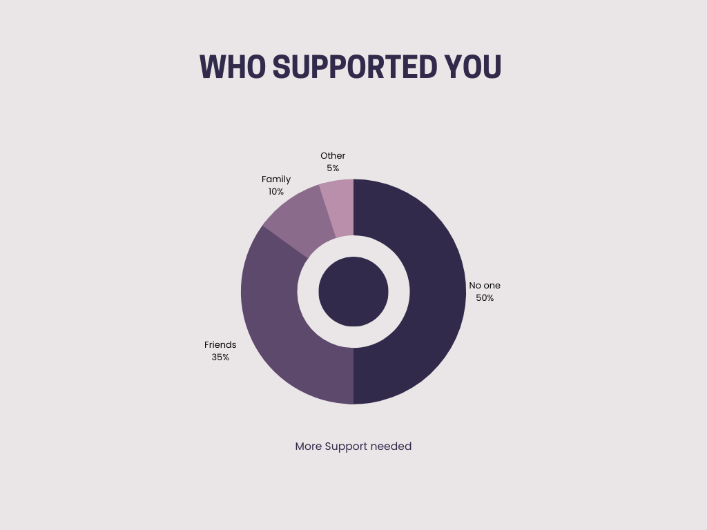
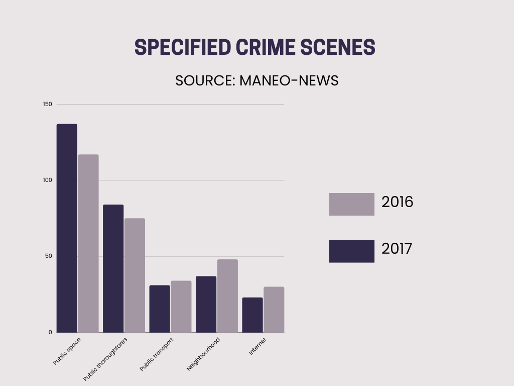
To avoid harassment, most of the victims rather avoid certain streets, and certain people and not wear certain clothes.
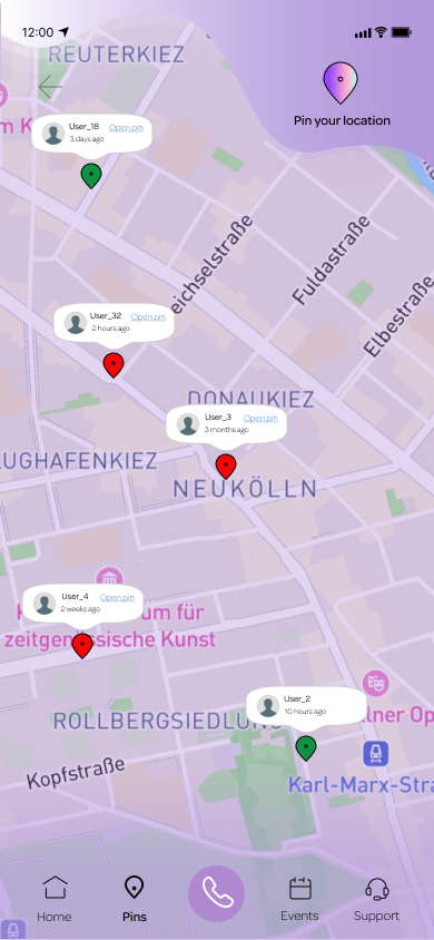
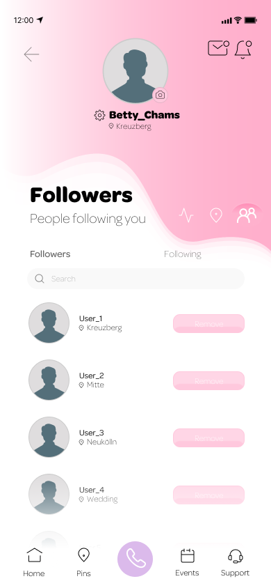
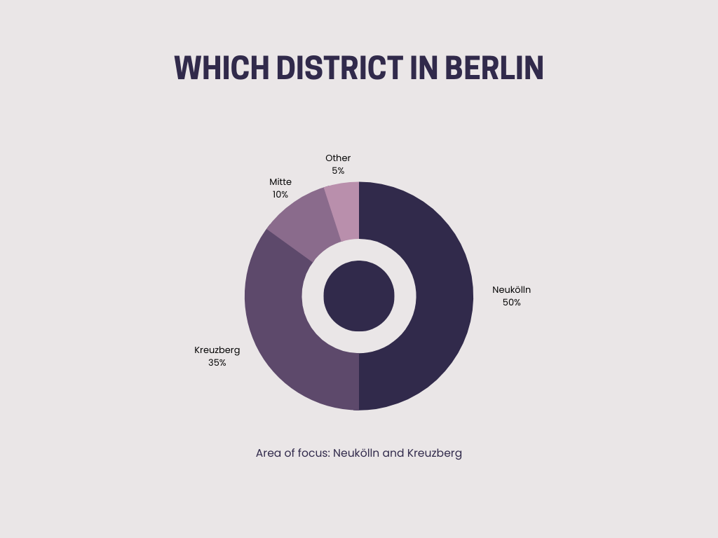
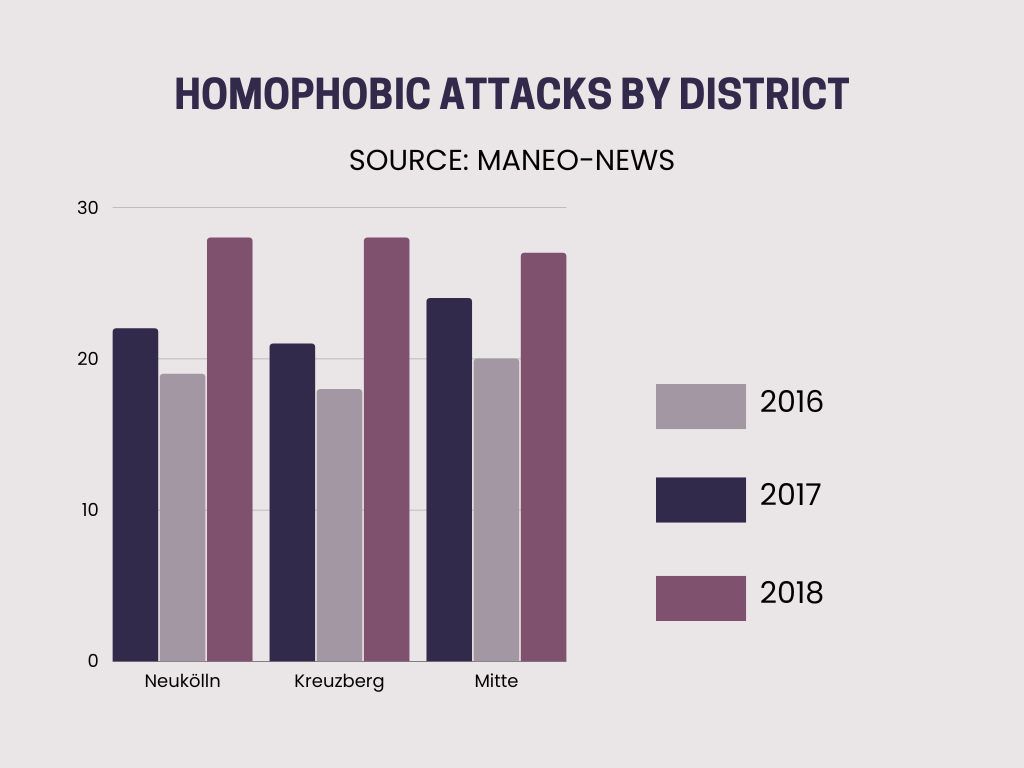
Areas of focus: Neuköln and Kreuzberg.
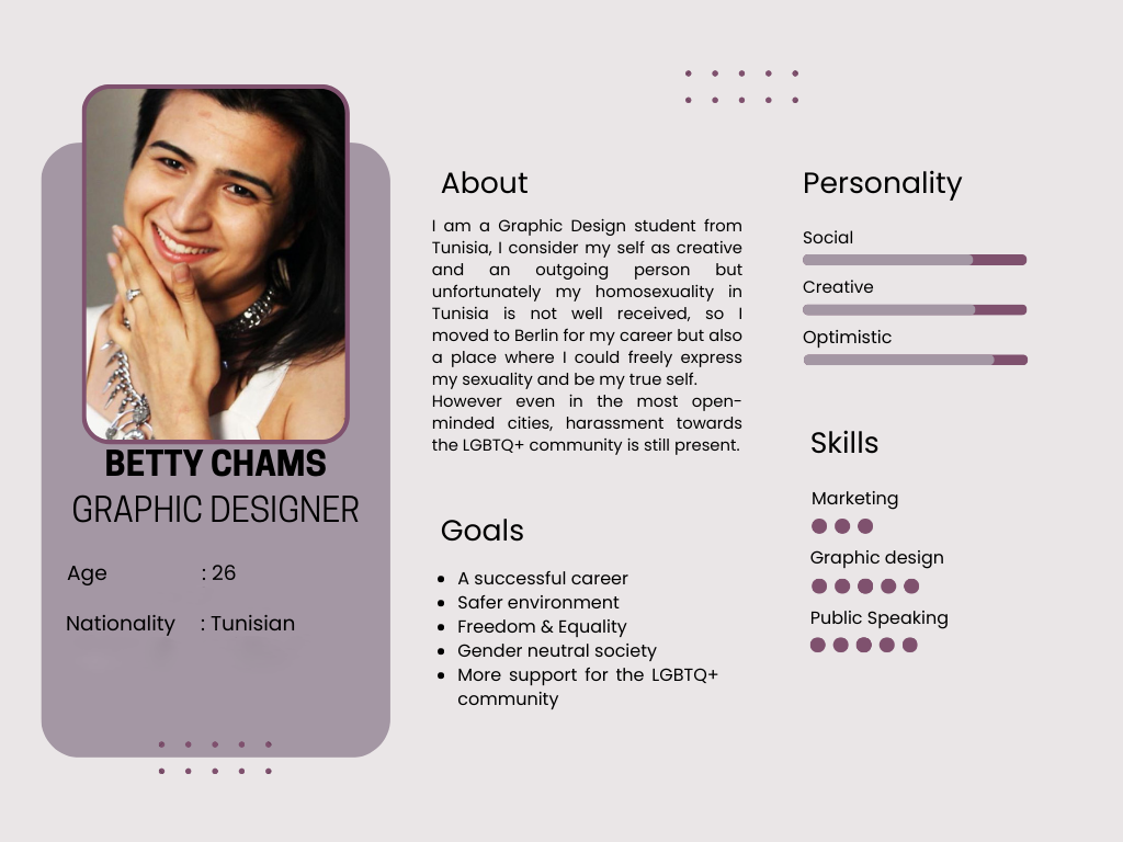
Persona
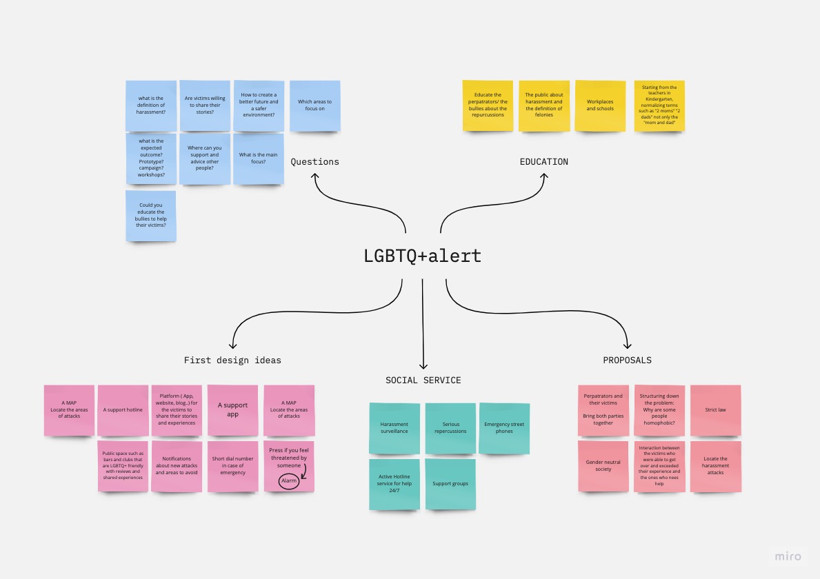
Affinity Map
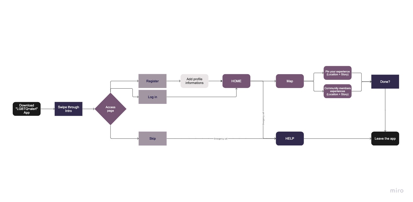
User Flow
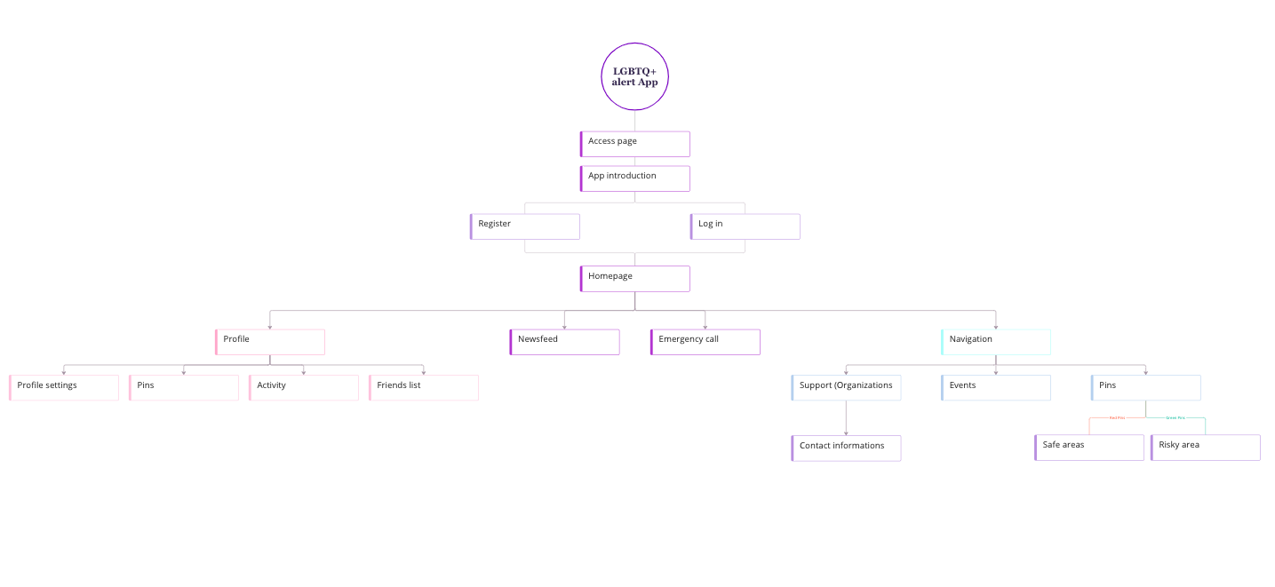
Navigation Map
UI Brand Guidelines
About
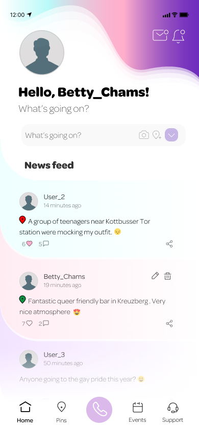
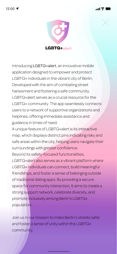
Introducing a groundbreaking app designed to ensure the safety and well-being of LGBTQ+ individuals in the streets of Berlin.
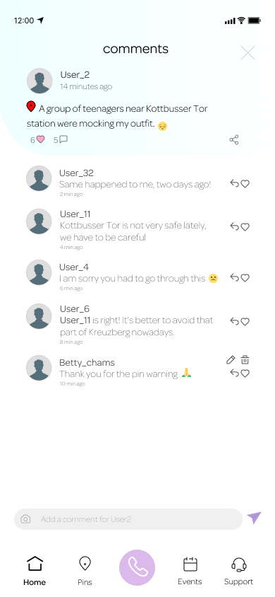
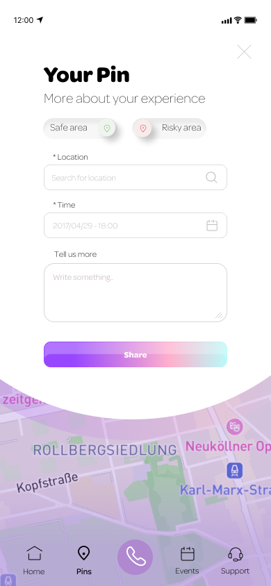
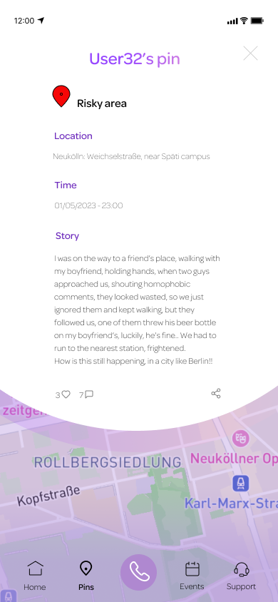
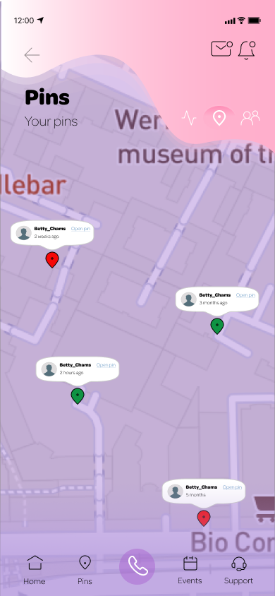
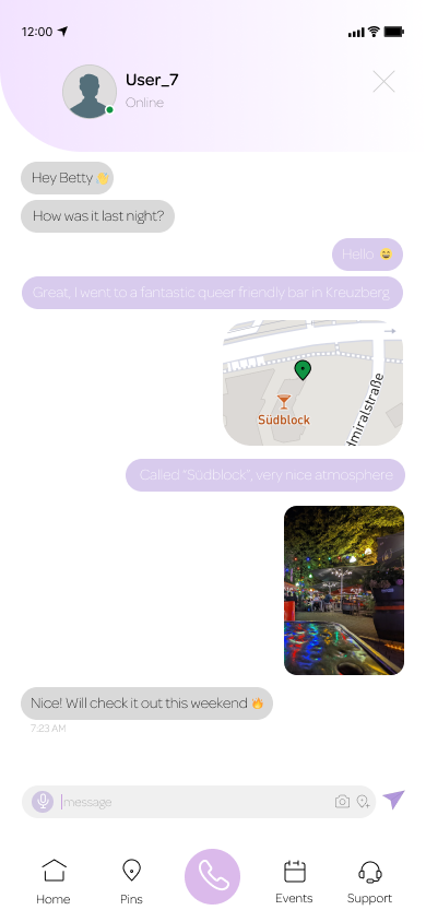
The app aims to combat harassment by providing immediate access to help and support through partnerships with reputable organizations. In times of distress, victims can reach out to these contacts for assistance and guidance. Additionally, the app features a user-friendly map displaying two distinct pins: risky areas and safe areas.
This intuitive visual aid empowers users to navigate the city confidently, avoiding potential dangers and seeking refuge in secure locations. Together, let's foster a safer environment and promote inclusivity for everyone in Berlin's LGBTQ+ community with an innovative app.
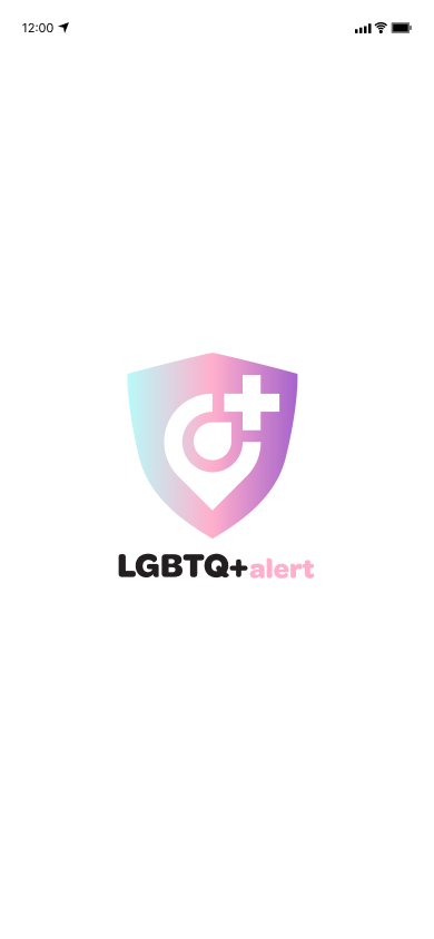
Logo
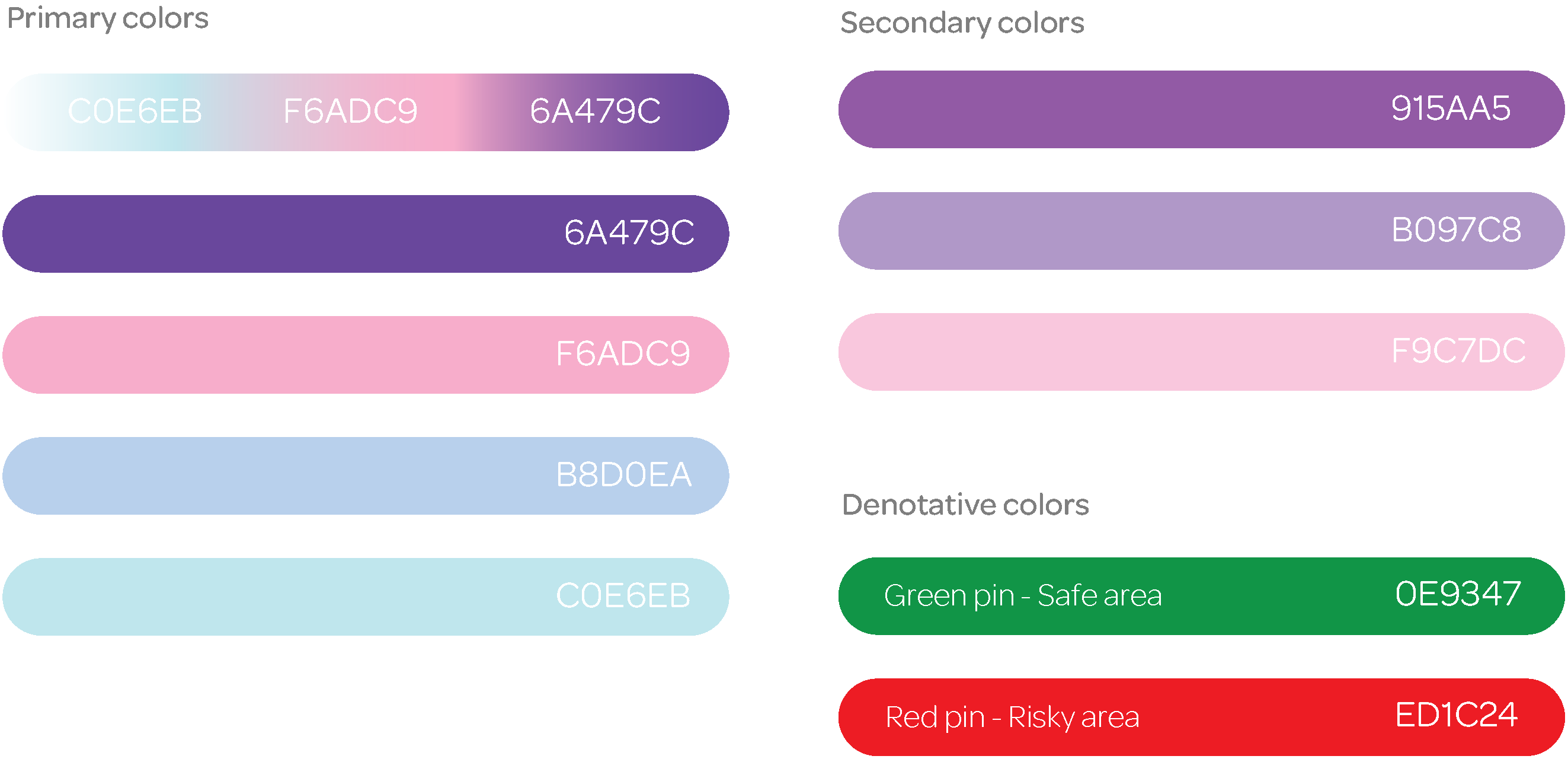
Brand Colors
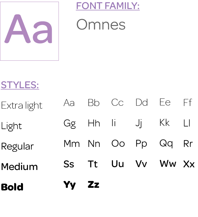
Iconography & Font Family
Mockups &
Interactive Prototype